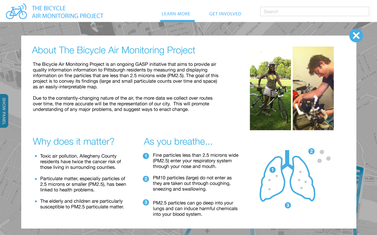
About The Project
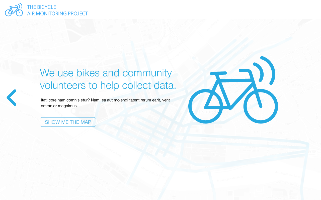
The Group Against Smog and Pollution (GASP) in Pittsburgh approached our team with air quality data collected by local cyclists and a rough map visualization. Cyclists volunteered to attach a combined air quality monitor & gps unit while riding their bikes around the city. The collected data was uploaded to a map where the locatoin and air quality data was visualized. We worked with the client to improve usability and accessibility to the project and data by the local community. This project was completed with support from GASP in the course Small Group Study in HCI at Carnegie Mellon University, Spring 2014.
I contributed as a user experience designer on a cross-disciplinary team of HCI graduate students. I assisted in the development and execution of a research plan in order to discover the primary target for the project and the strategy of how to gain the most value from data collected through the program.
CLIENT
Group Against Smog & Pollution (GASP) & Carnegie Mellon University
LOCATION
Pittsburgh, PA
ROLE
UX Designer, HCI Small Group Study
Initial State
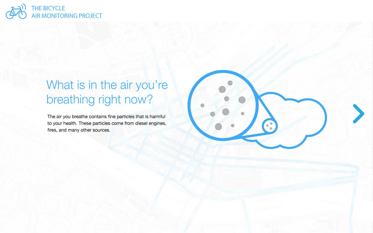
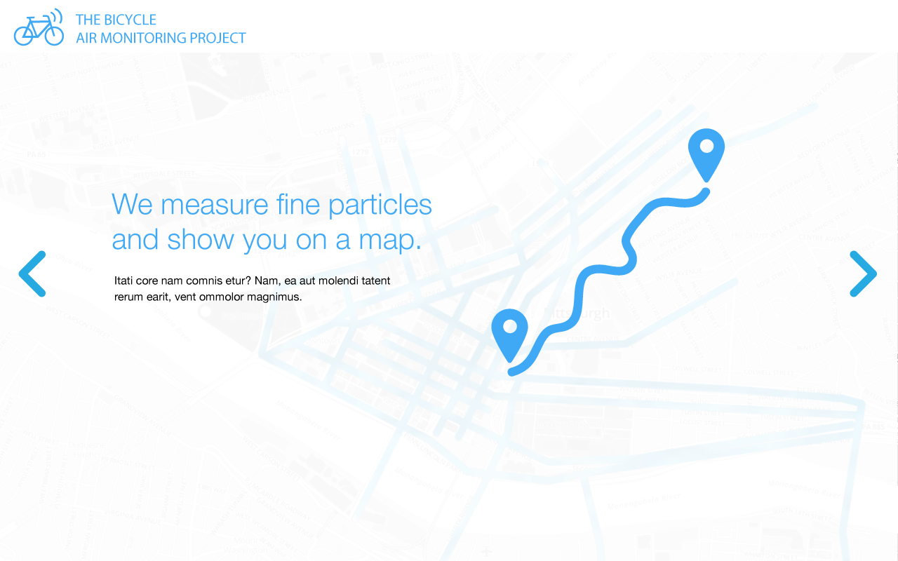
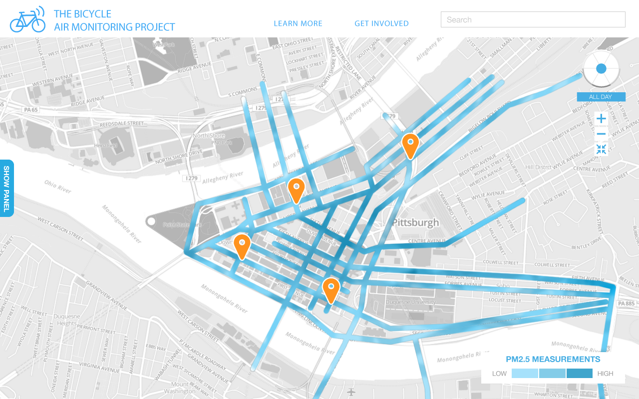
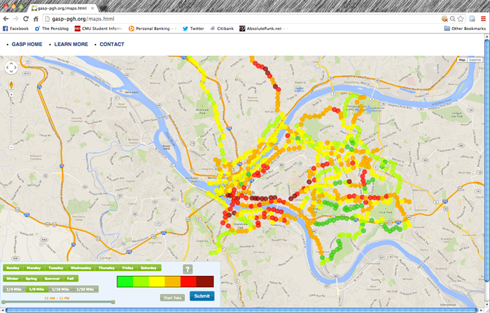
The initial map shared by GASP visualized the data air quality collected so far through the program. Each "point" represents either a single data point or the average of several data points collected in each location. The client's initial intentions were for the project to be used by cyclists in the daily planning of their riding routes.They additionally recognized that this data could potentially provide value to policy makers in pushing agenda's regarding air quality. In observing this map, we conducted a heuristic evaluation of its usability in order to avoid pitfalls in our design.
Research & Ideation
The client assumed two specific use cases for the data that was being collected through the program. First, they thought that cyclists would use the data to inform their daily bike route. Second, they hoped that the data could help to impact policy—but the exact way this impact could take place was unclear.
We took this information and set out ot uncvoer key stakeholders and how they're already using the map, as well as to make suggestions on how best to adjust the map for maximum imapct.
Through this process, we uncovered three opportunity areas for the program:
- Awareness: Letting people know about the air quality resources around them
- Education: Teaching people how air quality affects them
- Collaboration: Helping other community efforts by providing an open data set to them in a useful way
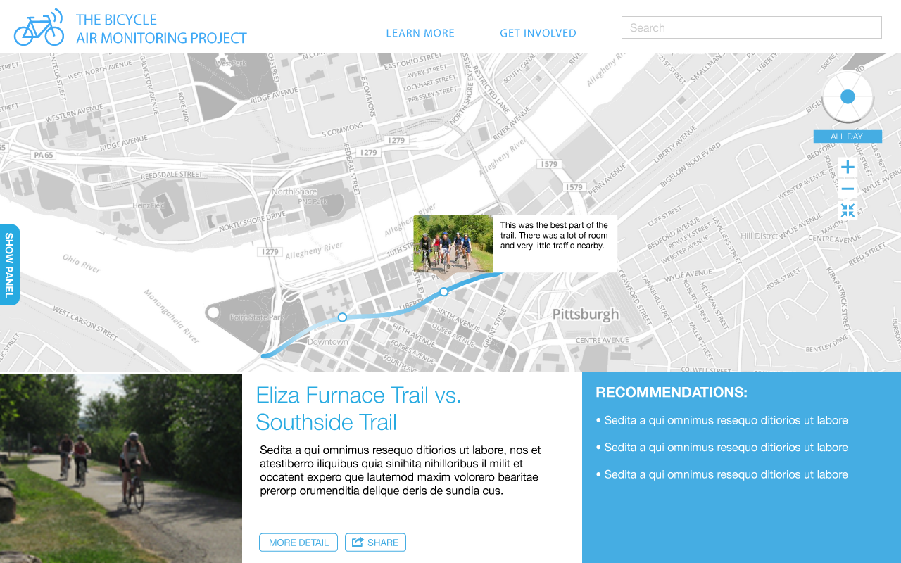
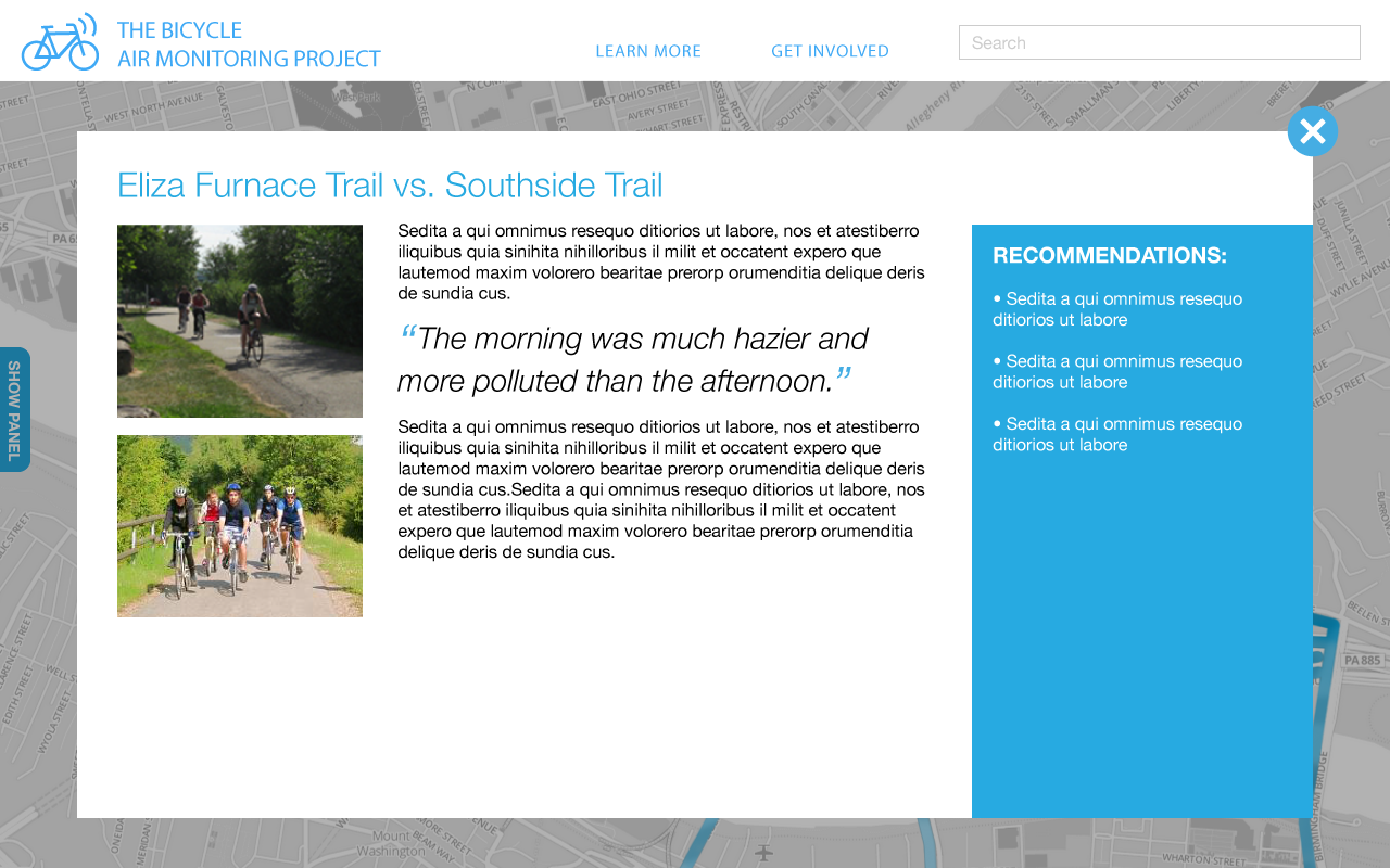
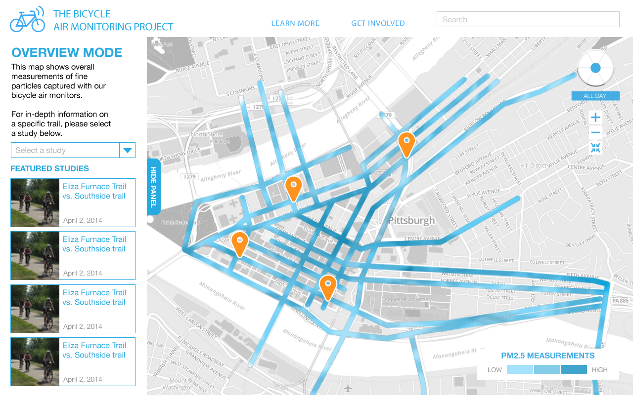
Solution
The final conceptual prototype begins with a three page introduction in order to frame the context of the map. The overall view shows featured studies on the left side and highlights them as points on the map. When clicked on, studies show insights and recommendations gathered from the data. The studies can be shared via social media, emailed, or downloaded to increase accessibility. Lastly, users can gather more information about the project, sign up to volunteer for future studies, and suggest areas of interest for future studies.